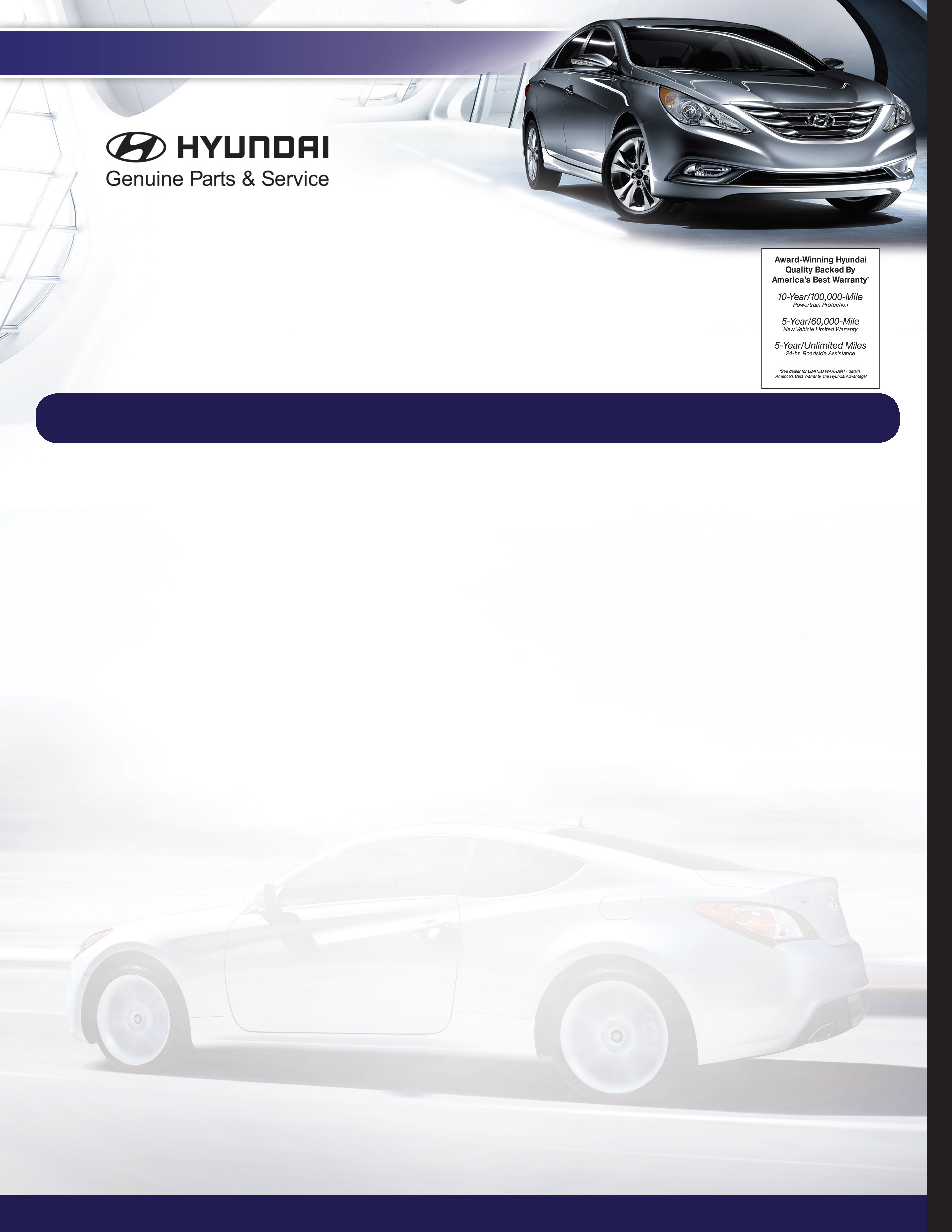
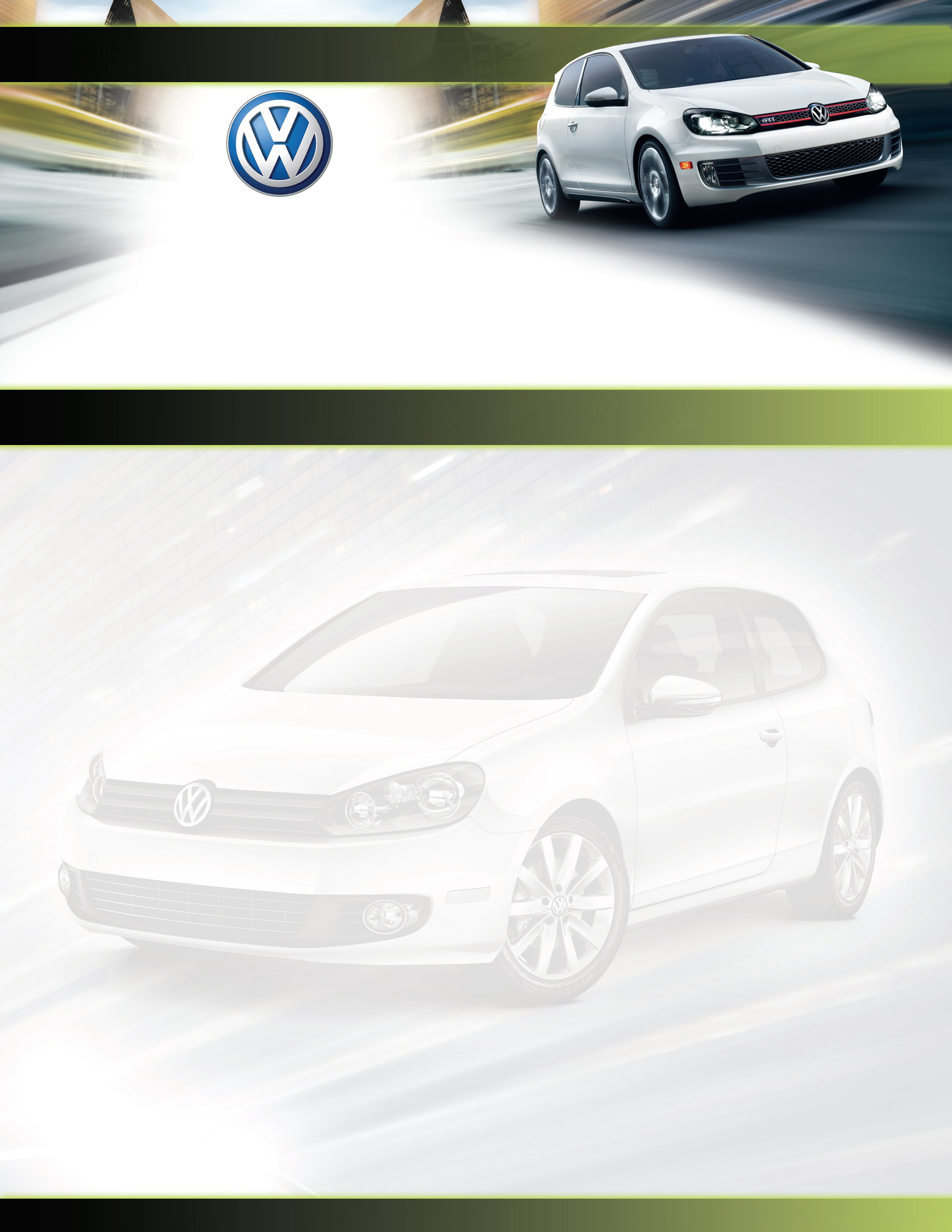
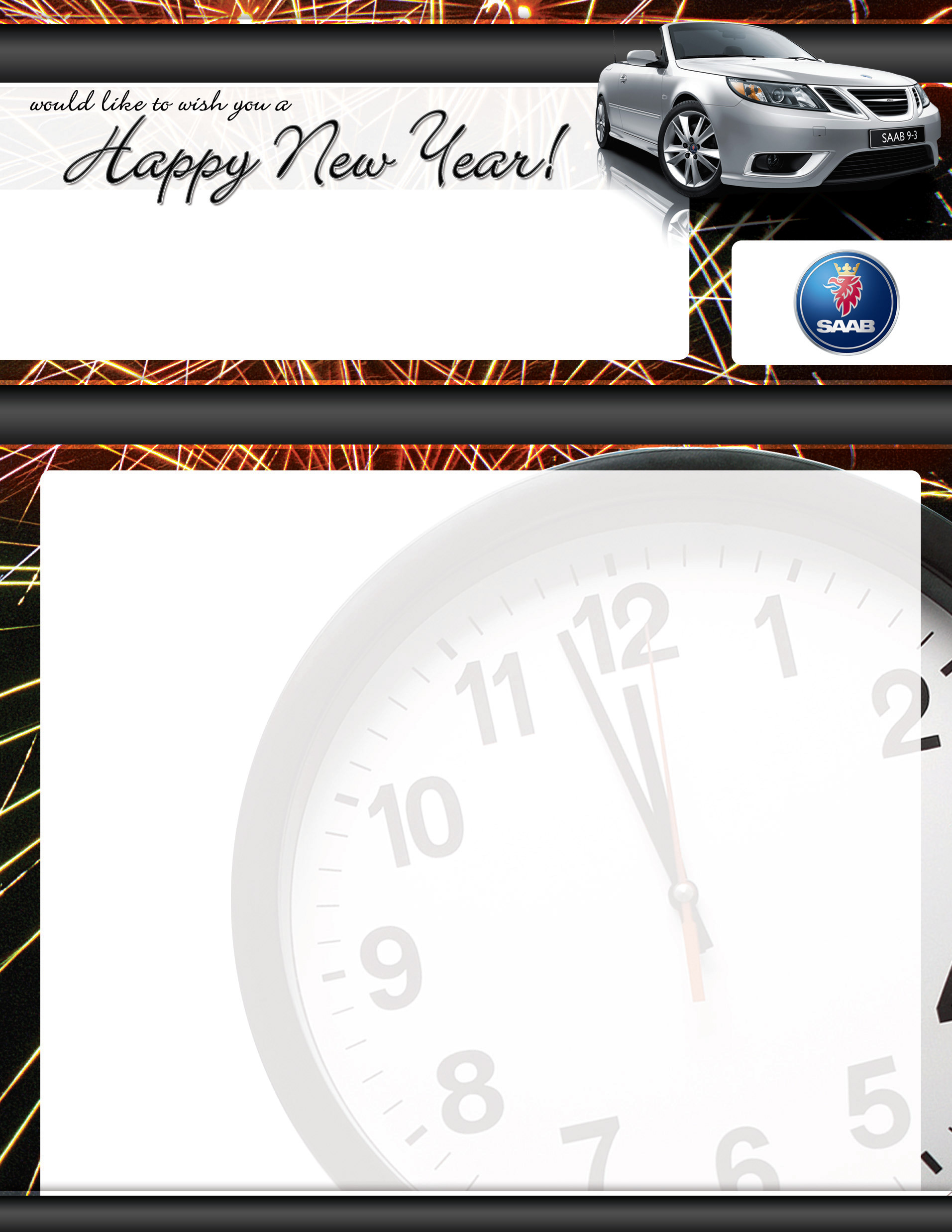
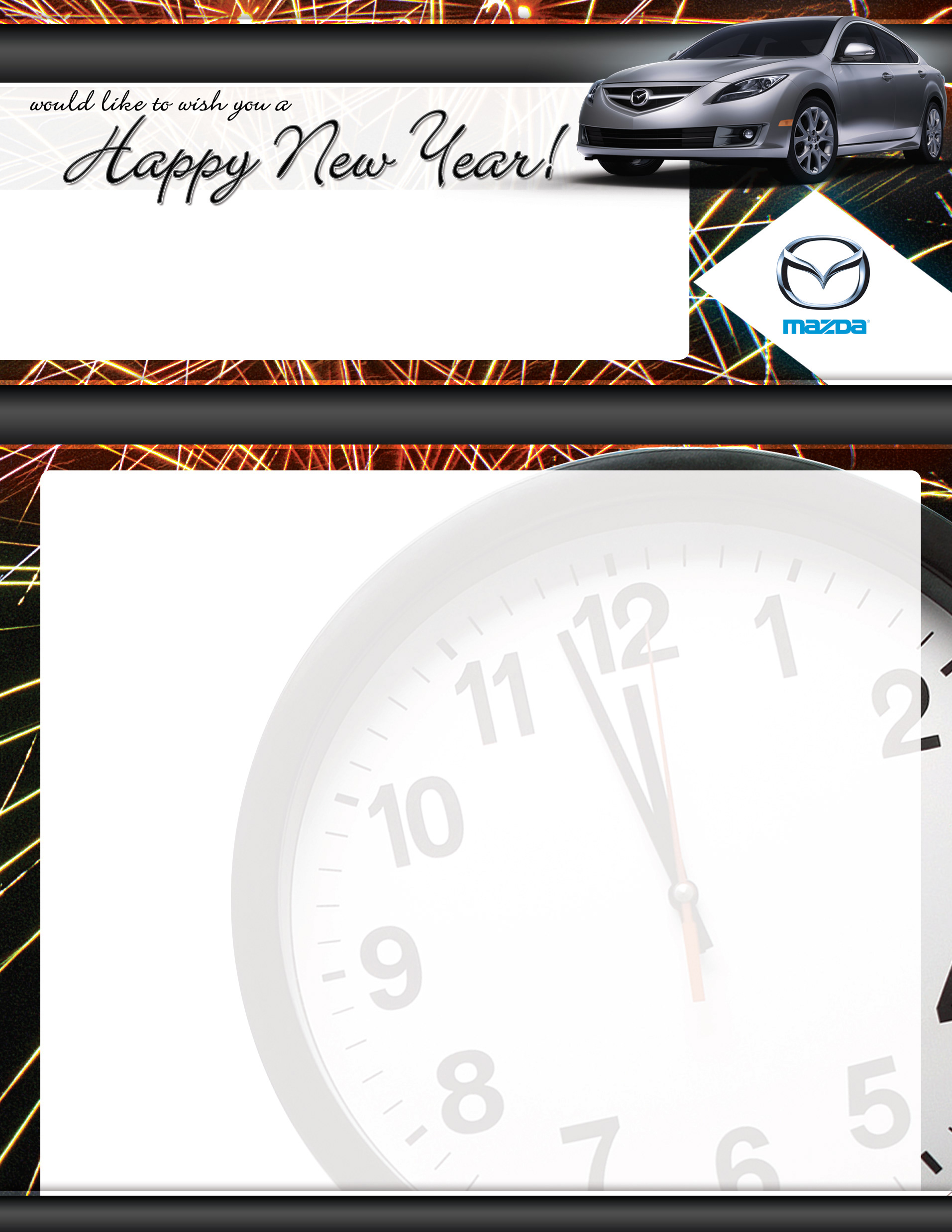
These backgrounds were part of a promo that was run by a dealer group. Each was to have standard coupons, dealer info, and address blocks that were added as part of a streamlined printing process that allowed thousands of postcards to be printed with different backgrounds variable text.


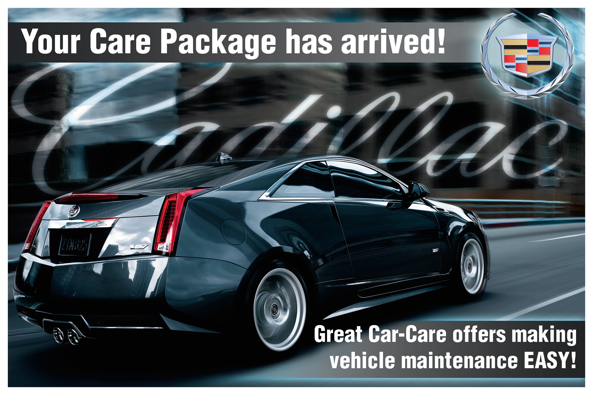

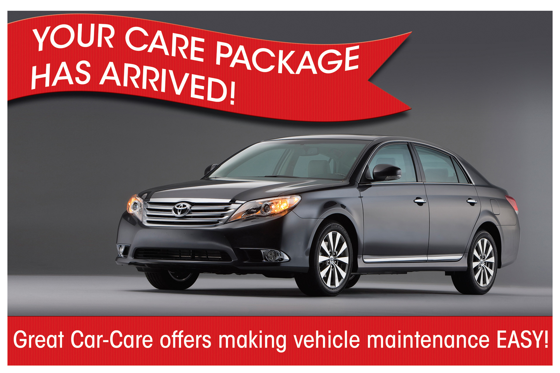


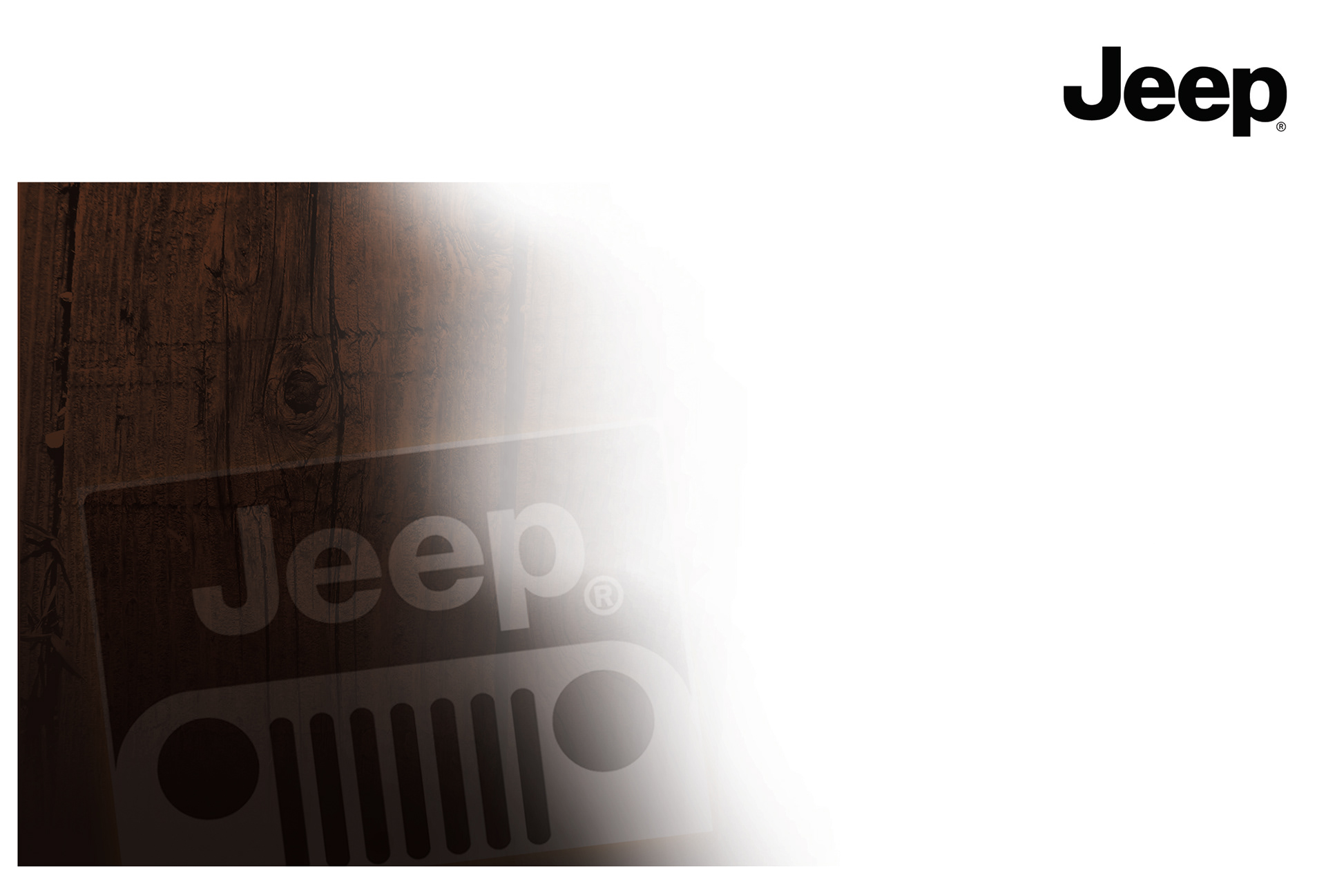


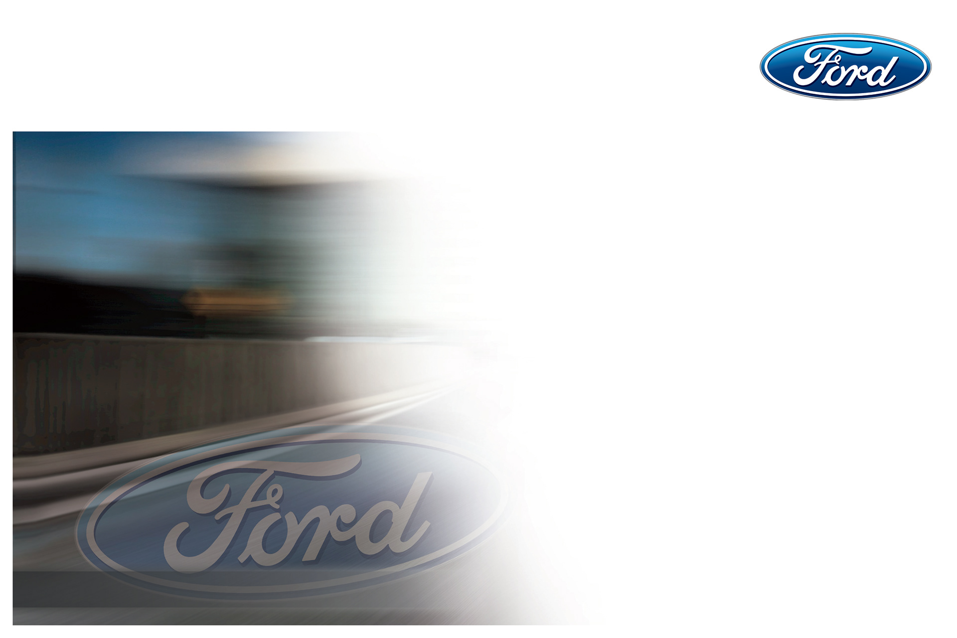

The postcard on the left was a custom design, only aimed at providing service coupons to some potential new customers. The dealer provided the offers and a few pieces of verbiage, and asked for something fun, but left the design largely up to my company. I chose to pick "beauty" photos from the art site provided to us from the dealership and let the images inform the rest of my design choices.
The postcard on the right was heavily art directed by the dealership, as they were trying to establish branding for multiple dealerships and fit both sales and service offers onto one postcard. Beauty shots would have had too many elements to easily tie all the information together, so we opted for plain photos of the vehicles and leaned on gradients to provide a little bit of flash.
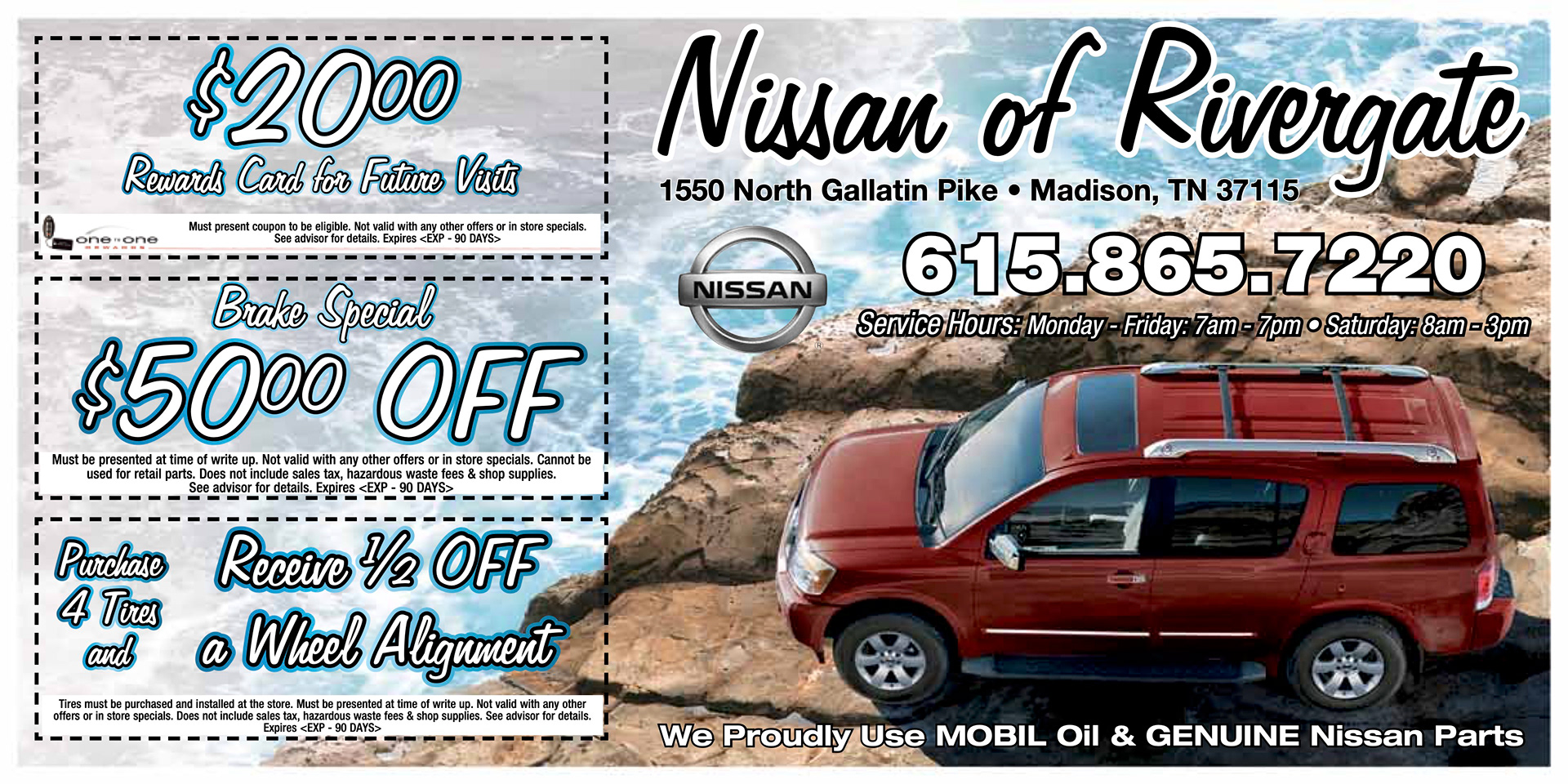
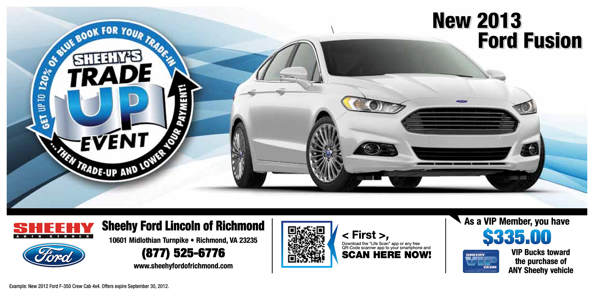

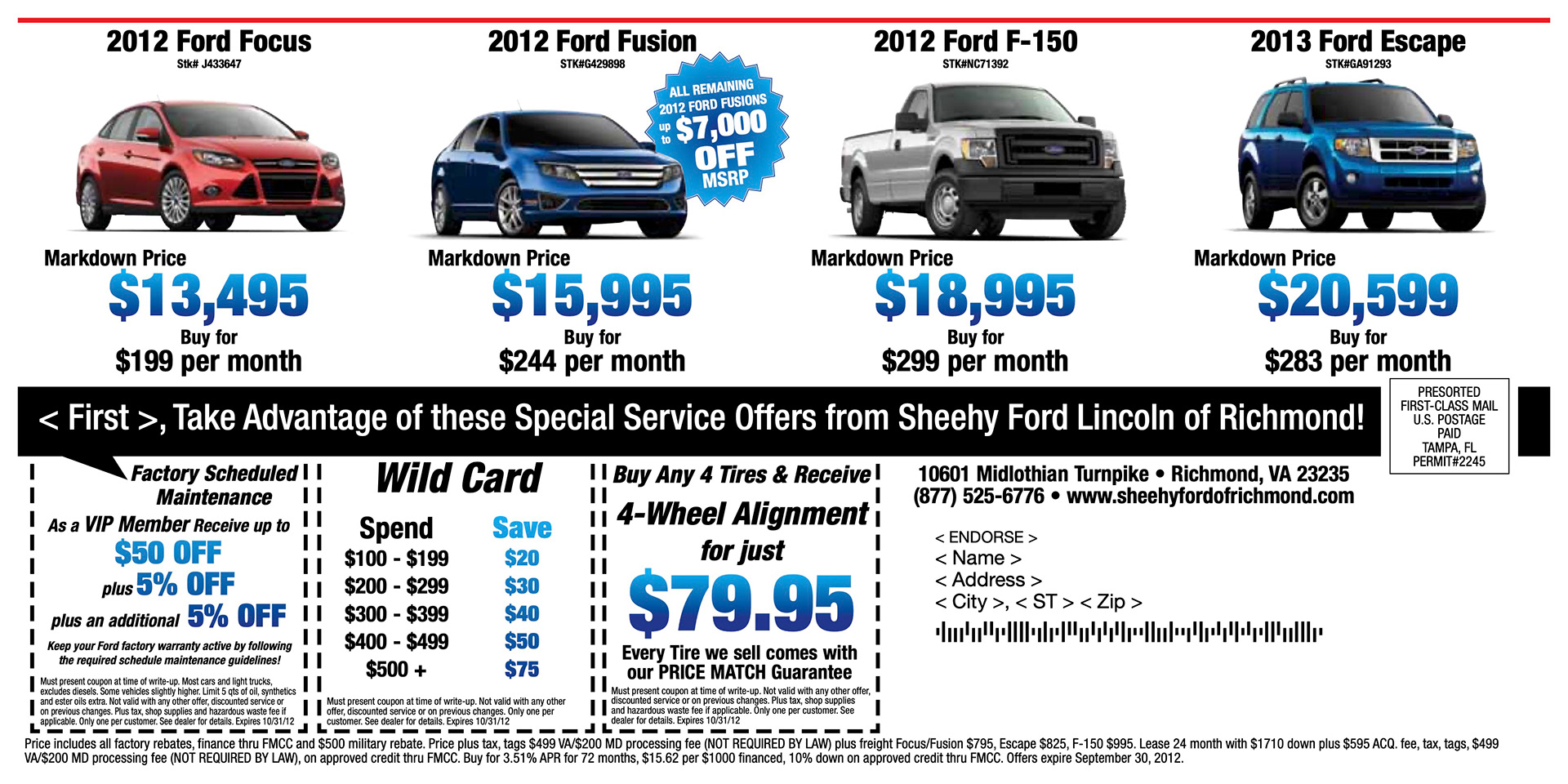
These are backgrounds of the left size of what is called a 3up check mailer. This mailer contained an address block and letter on the side seen below and the rght side consisted of 3 coupons that mimiced the style of a bank check that had different service offers on each.
